Three Pubs,
One Irish Spirit.
This is the public brand reference for The Dubliner — including The Dubliner Reykjavík, Litli Dubliner, and Dubliner Keflavík. Use the elements below to keep our look and tone consistent in collaborations, press, and partner materials.
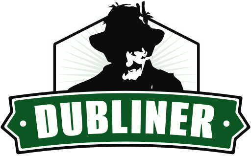
1. Logo
The Dubliner shield mark always travels as a single unit. Keep clear space around it equal to roughly the height of the inner letter. Do not recolour, distort, rotate, add effects, or place over busy imagery without sufficient contrast.
2. Colour palette
Dubliner Green is the primary identity colour, paired with off-white for warmth and ink black for text. Pub Red is reserved for accents — call-to-action buttons, sale tags, or highlights — and should never dominate a layout.
3. Typography
Two typefaces only, both available free from Google Fonts.
Body / UI
The Dubliner is Reykjavík’s original Irish pub — three locations, one warm welcome. Whether you’re after a quiet pint by the fire or a packed Saturday night with live music, you’ll find your kind of evening here.
4. Imagery
Photography should feel warm, communal, and unposed. Think candid pub moments — a fresh pint mid-pour, a dart finding double-twenty, friends mid-laugh under amber light, plates of stew and fish & chips on dark timber. Lean into golden interior tones, deep greens, and rich browns. Avoid sterile, over-lit, or staged studio shots.

- Light: warm tungsten, candle, fireplace, golden hour.
- Subject: people, hands, food, drink, darts, sport on screens, live music.
- Crop: close and intimate; let elements bleed off the edge.
- Avoid: cold blue tones, empty rooms, stock-photo composition, heavy filters.
5. Voice & tone
Friendly, plain-spoken, and proudly Irish. We greet guests rather than market to them. Short sentences. Specific over generic. We say “pint” not “beverage”, “hearty” not “indulgent”, “play darts” not “engage in dart-based experiences”. Humour is welcome but never at anyone’s expense.
6. Downloads
Questions or partnership enquiries: agnes@dubliner.is.